Dynamic Line Assignment
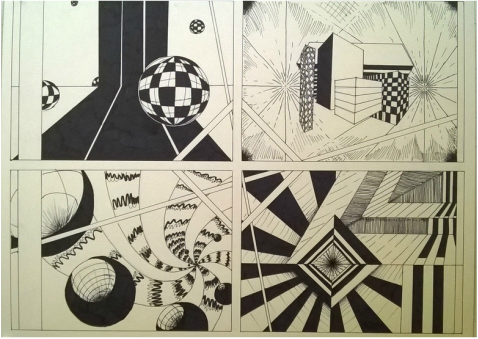
During the critique with my peers I received relatively positive comments about my pieces. One of the comments made me realize something about my piece that I hadn't before. She mentioned that the fourth quadrant gave the feeling of a turning motion. Most of the comments were about the second and fourth quadrants as people believed they were good examples of movement and depth. I feel that my third quadrant is the lesser of all the pieces as it does not look as polished or as interesting as the others. If I would do this project over again, I would absolutely work more intently on that section. Through the critique I was able to see many ways of accomplishing the same task but through different means. The other works will definitely inspire me should ever set out to work with dynamic lines again
The Parts and the Puzzle
I found this project to be challenging. With the restriction of using only six shapes--two rectangular, two circular, and two lines--it proved to be a difficult matter of being inspired but reigning in and keeping the image relatively minimal. I found a lot of interest in making implied lines, mostly by cutting into a shape and distancing it from its whole. I also notice that I used mostly large shapes. I was also more interested in solid shapes rather than ones with a gradient.
GIF Creation
Pattern Saturation
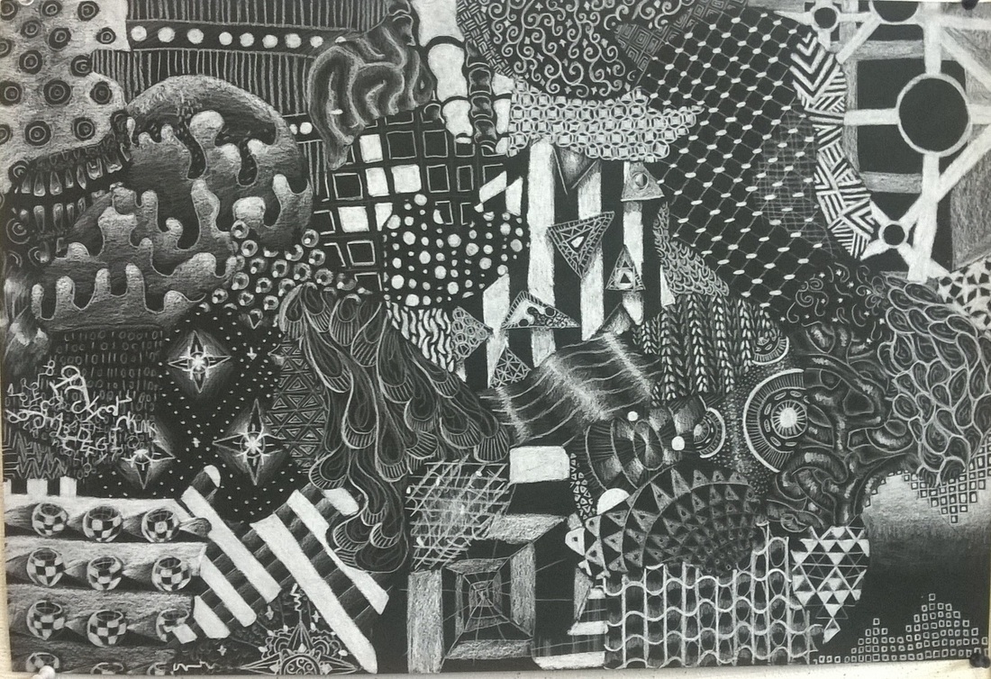
This project was about creating one unified whole through the use of varying patterns. Overall I m happy with how this piece turned out, however I feel that there are some weaker patterns due to some issues--mostly my arm was tired of pressing so hard and after coming up with so many patterns I found it hard to continue to make equally good ones in the remaining spaces. I also think that Had I done this differently I may have tried repeating patterns a bit more to get a greater feeling of togetherness throughout.
Texture and Value
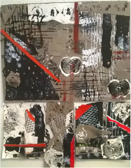
For this project we created stamp like plate that had interesting textures and used paint to stamp the images onto paper. My piece consists of four works that tie together, one large and the rest small. I made a lot of visual textures through the use of the stamps as well as actual texture made from paper and hot glue.
Josef Albers Color Exercises
Value

Intensity

Hue

Custom Pattern Swatch
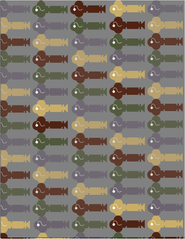
For this project we designed a logo that had a significance to us and repeated it in order to create a pattern. My Object is based off of a key that I always have on my key ring with a small white Leo symbol from the zodiac. Leo is my birth sign and I wanted to incorporate it in my design and it seemed natural to overlay it on the hole of the key. Foe the color choices I wanted to use a muted palette of two complementary colors: red and green, yellow and purple. I left the Leo symbol white to create and emphasis on it and made the background gray to offset the rest of the colors. This was my first time using the program Illustrator. Because of my lack of familiarity with the program I found myself limited in what I could accomplish, therefore my final piece was greatly altered from my original concept. However, despite the difficulties I had working on this I am ultimately satisfied with the pattern I have created.
Zine
Primary brainstorming
For my zine I plan to create a sort of scientific journal that documents creatures of my own creation. The creature are based off of human organs combined with slight technological aspects as well as those of certain animals. It will feature a total of 6 creatures as well as a look into the environment of their world as well as the flora.
For my zine I plan to create a sort of scientific journal that documents creatures of my own creation. The creature are based off of human organs combined with slight technological aspects as well as those of certain animals. It will feature a total of 6 creatures as well as a look into the environment of their world as well as the flora.
|
Elements of Art used:
Color I used color minimally to create a faded look Value was created through hatching and cross hatching to create shadows Line Was was the primary element in my Zine, it created most of what is in my zine Texture Smooth textures were created using line as were some hair-like textures Shape Many of my creations were made from simpler shapes Form the forms were made through the use of color and line Space I created space by overlapping items |
Principles of Art Used:
Balance I created balance by keeping both the right and left sides of my pictures equally filled Contrast Contrast was created with the use of color and keeping much of the paper's own color Emphasis I placed emphasis by making the creatures generally the largest thing on the page and keeping them somewhat centered Movement I used line to create a sense of movement within the creatures Pattern was created through the repetition of elements such as the red cell leaves Rhythm was achieved by repeating elements like the trees in a row Unity was made throughout the book by repeating color and line variations |
